Posts

Showing posts from April, 2019

Aural Textiles. Hybrid practices for data-driven design - EAD2019 conference

Image
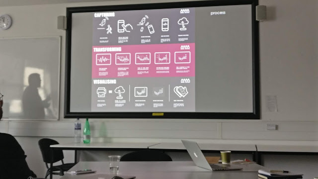
Aural Textiles. Hybrid practices for data-driven design George S. Jaramillo, Lynne J. Mennie http://radar.gsa.ac.uk/6464/1/RwS_full_paper_REVISED%20JAN2019_FINAL.pdf Notes: Listening and hearing soundscape Spectogram (visual representation of the spectrum of frequencies of a signal as it varies with time. Researchers created a set website for sharing experiences, of a year long study of landscape sound digital design with a group of textile practitioners across Scotland Output - paperback book of patterns So What?               Augmentable - person and device could begin to work or augment maker/producer to have a                better sense of their environment.               Get artists and designers to interpret.               Use textiles to represent data               Experimentation - Community               Collaboration - Future collaborations without input from researchers. Begin to interchange                  ways of making. So What?              It

Considering Haptic Feedback Systems for A Livable Space Suit - EAD 2019 conference

Considering Haptic Feedback Systems for A Livable Space Suit Torstein Hågård Bakke, Sue Fairburn Considerations and notes: Diminished taste and colour awareness in space Diminished senses Space suit cap created with algorhythms - sound into instrumental patterns onto vest = sixth sense

Professor Tom Inns - EAD Conference

Image
 Keynote speaker Professor Tom Inn's presentation 'Bringing Design Thinking to Complex Challenges'. Detailed workshop methods. Global Risk Report Draw yourself as a tree of knowledge - the leaves represent current interests. Neurodiversity  https://neurodiversitysymposium.wordpress.com/what-is-neurodiversity/ Sandpit projects  https://epsrc.ukri.org/blog/building-research-ideas-in-a-sandpit/ Encourage diversity of thinking. As an 'architect' would. Micro to Macro in an instant. https://www.weforum.org/reports/the-global-risks-report-2019

Hidden Impact - simple graphics

Image
These graphics were presented in one of the keynote talks. Interesting that these images were included, as the keynote address was confusing and rambling. Including these graphics as a possible reference, for thesis presentation. 

Empathy Map - inclusive design for immersive spaces

Image
EAD Conference. Paper: 1309 Inclusive Design for Immersive Spaces Michael Crabb, Daniel Clarke, Husam Alwaer, Michael Heron, Richard Laing Empathy Map The Best Interface is no Interface. Krishna Golden 2015 http://accessible-reality.org/workshops.html Crabb, M., & Clarke, D. (2016). Inclusive Design for Immersive Spaces. http://www.accessible-reality.org/workshops/inclusive-design-for-immersive-spaces: Accessible Reality.

Data - represented in 3D

Image
Stefanie Posavec's Air Transformed  necklace; which manifests pollution levels and data in the form of tangible, 3D objects. As my research explores 3D animation and the world of the blind and visually impaired, I think there could be an opportunity to present my findings in 3D, so that the participants may also 'feel' the data. The further two images, indicate other possible ways of representing my data, using 3D animation, photogrammetry, and modelling. http://www.stefanieposavec.com/airtransformed

virtual flood_westervoort

Image
Virtual Flood, Westervoort, Netherlands https://www.fastcompany.com/3043184/this-eerie-virtual-flood-will-scare-you-into-giving-a-damn-about-climate-change

LTHE_Teaching Observation. Lesson plan

Image

OPD_infographics and visualising data

Image
Visualising data in qualitative research. Stuart Henderson, Eden Segal  http://www.ndedataviz.com/chapter-3--visualizing-qualitative-data-in-evaluation-research.html Using NVivo for qualitative thematic analysis  http://www.qualitative-research.net/index.php/fqs/article/view/865/1880&q=nvivo+manual&sa=x&ei=zah_t5pqoyubhqfe9swgbq&ved=0cc4qfjaj Online tools templates Wordle (wordclouds)  http://www.wordle.net/ Easel. ly (turn data into infographics)  https://www.easel.ly/ Hohli (chart builder)  http://charts.hohli.com/old/ Pixlr (photo editor)  https://pixlr.com/ Venngage (graphic creator)  https://venngage.com/ Dear Data infographics. Essentially coded patterns relating to data.

TMC_01 - Progress Report

Image

Bio profile for EADPhD event - DJCAD Apr 9 2019

Image

EADPhD event - reception graphic

Image
A short animated loop, as a sign-post graphic, displayed in the DJCAD reception, for the EADPhD event taking place in the South Gallery, Matthew Building

EADPhD Event - EAD Conference April 9-12 Dundee, Scotland

Image
Animation and VFX created for the PhD event at the European Academy of Design conference at UoD April 9th 2019. Footage, animation and VFX compiled into a short looped film, to be projected during the actual event in DJCAD's South Gallery, Matthew Building. https://ead2019dundee.com/